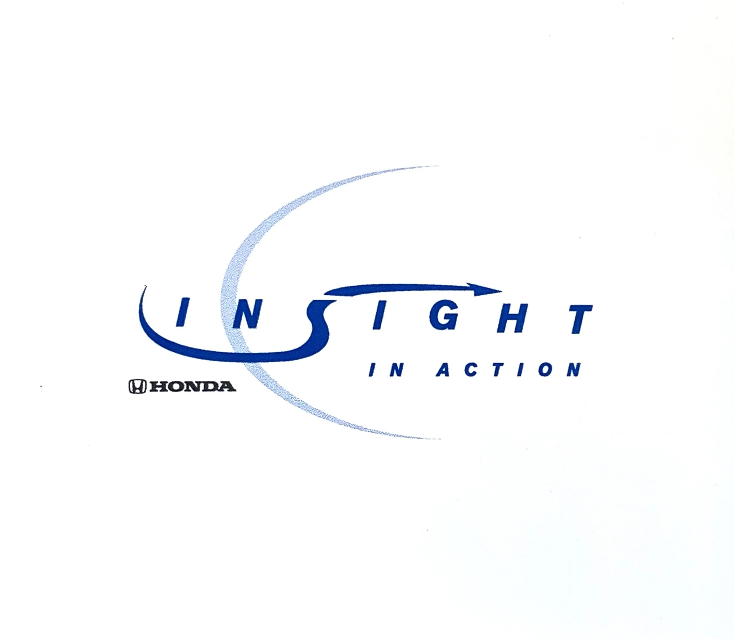


CLIENT:
Honda
OBJECTIVE:
Capturing Honda Insight's agile spirit.
CLIENT:
Bubble Yum
OBJECTIVE:
Playful name and logo for Bubble Yum kids’ bath line.
CLIENT:
DownBeat Magazine
OBJECTIVE:
Lowercase letters and a dropped “beat” echo the loose, smooth spirit of jazz.
CLIENT:
CDC Youth Media Campaign
OBJECTIVE:
Encourage inner-city teens to join the CDC Youth Media Campaign for healthier living and success habits.
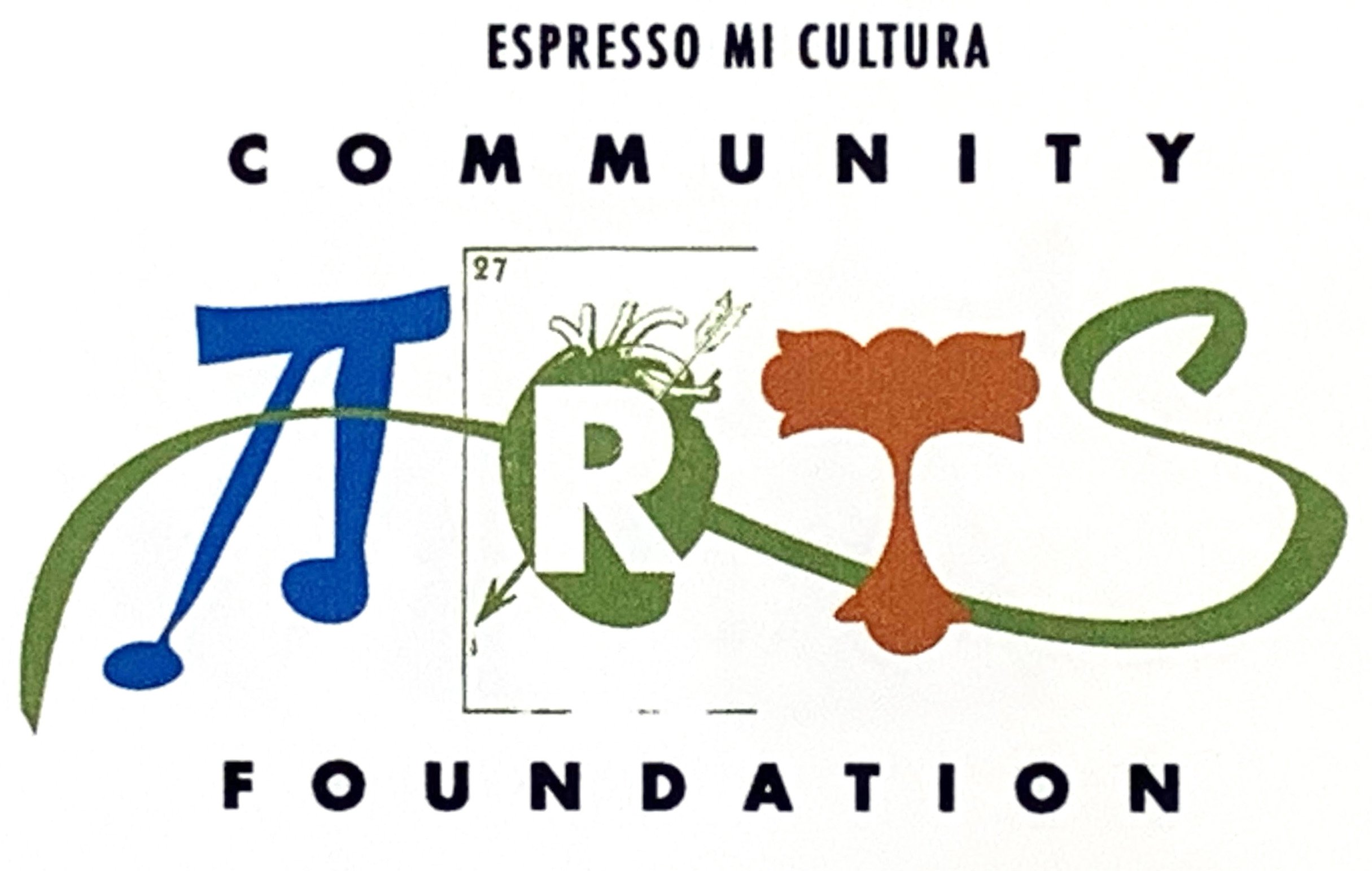
CLIENT:
Espresso Mi Cultura
OBJECTIVE:
The logo for ARTS supports Latinx artists, using symbols and letter forms to represent various art disciplines.
CLIENT:
Cinefex Magazine
OBJECTIVE:
Re-branding of special effects magazine renamed to SIX. "SIX" symbolizes the creative intuition and imagination of artists.
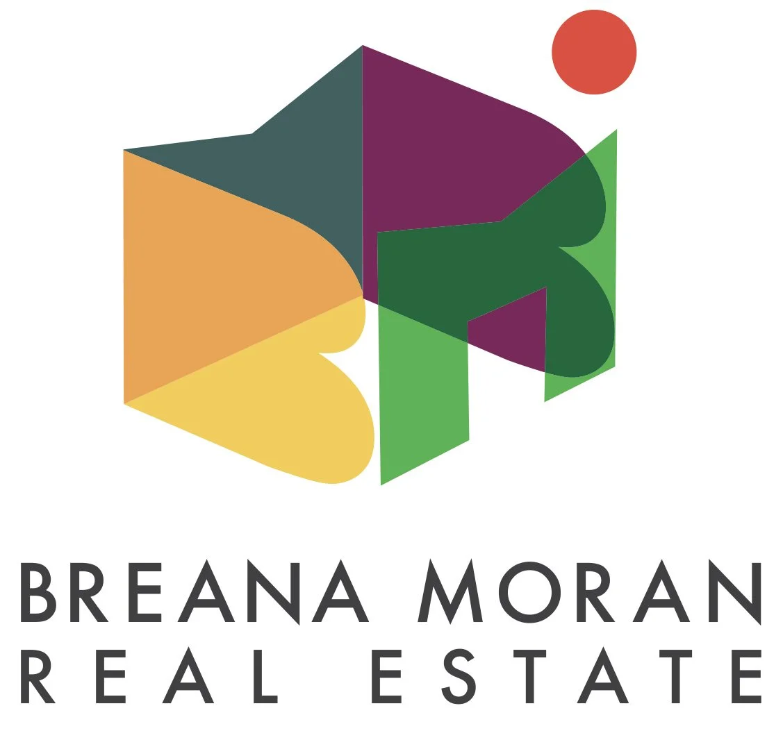
CLIENT:
Keller Williams
OBJECTIVE:
B and M symbolize walls, doorway, and California warmth.